
Actuarial cash flow models can quickly become complex, with dozens of interdependent variables. When that happens, it's easy to get lost in the code. That's where Graph View, a new feature in the cashflower Python package, comes in.
Graph View lets you visualize your entire model, making it easier to understand how variables depend on each other - and debug or explain the model to others.
How to use it
To open the Graph View, go to your terminal, navigate to the folder with your model, and run:
python run.py --graphThe --graph flag tells cashflower to launch the model in graph mode. Your default browser will open a page like this:
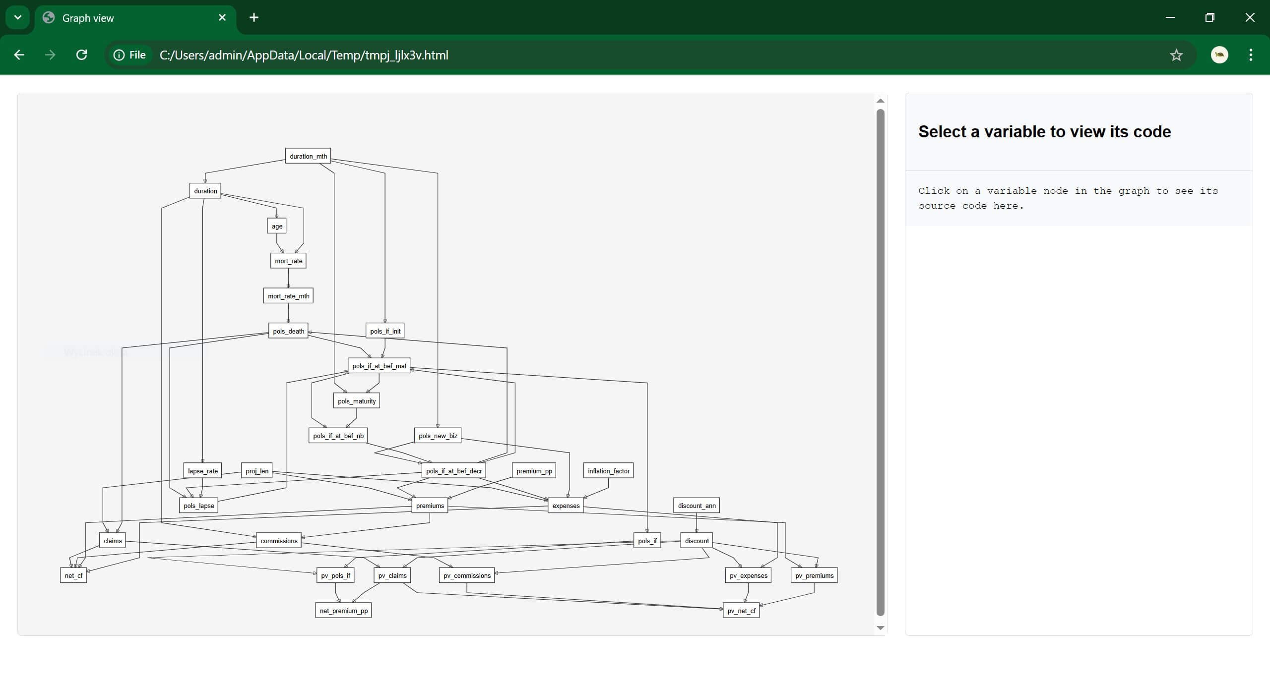
You'll see a full map of your model — each box represents a variable, and the arrows show how they are linked.
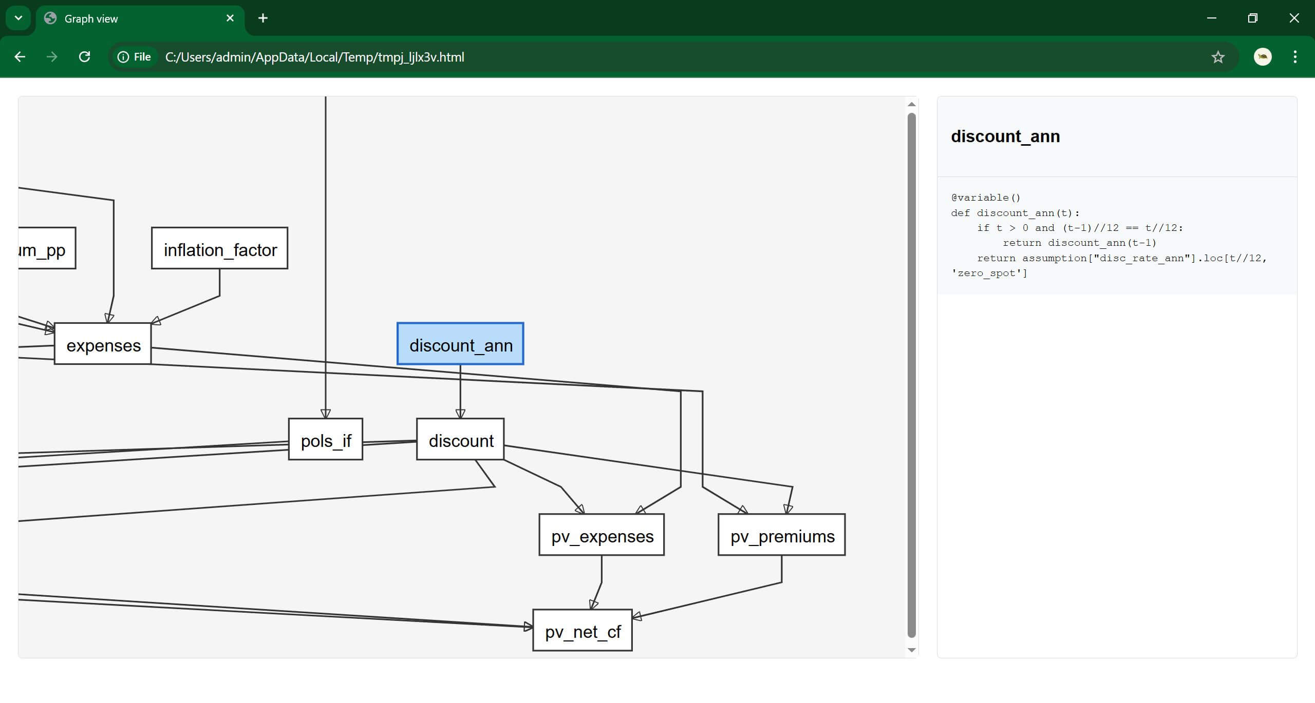
Click on any variable to view the code behind it:
Why it's useful
The Graph View gives you a bird's-eye view of the entire model. It's especially helpful when:
- you want to understand how a single variable is calculated,
- you need to check what drives a final result,
- you're reviewing someone else's work (or your own, but weeks later).
It's also a great way to explain the model to colleagues, auditors, or stakeholders.
If you have ideas for improving the Graph View or want to see other visual features in cashflower, let us know in the comments or open a GitHub issue.
Happy modelling!